
I’ve just finished reading Storytelling With Data by Cole Nussbaumer Knaflic. Below are my own personal notes, most of which I think relate closely to implementation in automation industry usage.
What to convey
This is where most of the stakeholder miss the most. We will need to have a lot of context to deliver actionable dashboard. But on the other hand, we are given low budget and/or time. In the book, it is explanatory vs exploratory.
A not well-thought dashboard will need additional “data crunching” which is the same as getting the information from historian, and null-ing the existence of dashboard.
Who
The very basis of the existence of the dashboard. Who is going to consume the dashboard:
- Planner will be more interested in which batches are planned vs completed, and perhaps OEE of the equipment
- Operation Supervisor may be more interested in if there is any downtime planned for equipment
- Engineering is more interested in the health of the equipment
What
What message to convey to the “Who”.
Most often than not, we are given the task to show “Equipment Status”, without given the “who” is going to see the dashboard, so what “action” to be taken with the data given.
Equipment “health” status is not something planner is keen to see, but they (planner) may be happy to see that they still have machine time (“OEE”) to fit in production schedule. But on the other hand, equipment “health” status is important to engineering so when any machine have any issue, it is a one glance to see what can possibly cause the downtime.
How
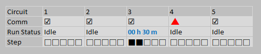
Let us take an arbitrary example, we have historical data of valve failing resulting in down time for supply cylinder from service report. This valve failing is the cause of 30% of the downtime for supply cylinder.
So, when we design the dashboard “cylinder status”, we may need to include:
- Cylinder service status (to see if there is any maintenance, or cylinder change in progress)
- Vessel gauge (to see how much material left in vessel)
- Valve status (quick glance for response team, since this accounting to 30% of identified down-time)
- Leak detector (for monitoring, can be life saving if it is toxic gas contained)
- O2 sensor value (for safety reason if response team need to go and check)
- Location (so that action can be taken immediately)
In one glance, response team will know what they need to bring
Simple Text
When we only have one or two number to share (e.g. OEE performance for the week, yield forecast for the batch), simple text is a good way to convey the message.
Styling
- Position to upper left, or center of the screen. Avoid bottom right.
- Colour to use corporate colour if possible, otherwise any colour that pop (e.g. Blue)
- At least 2.5 times the font height from standard font size
- Caption can be a sentence, but keep standard font size
- Subject in caption to use same font colour
- Use appropriate decimal point (e.g. OEE 89% is similar to 88.96% when shown). Whole number whenever possible
Do not use Simple Text whenever there’s a need for comparison (e.g. Target vs Actual, elapsed time). Do not lose context
Table
When we need to show a list of items or comparing values, tables are great. Especially when the table is for mixed audience whose member of the group will look for different topic.
Styling
- The design will need to fade into the background, letting the data take the center stage
- Use gray or muted font colour for heading, and black for content
- Use colour pop if needed
- Border is for legibility improvement, but should be muted compared to content
- Heatmap can be used, if we are to highlight ranking across multiple column
Next book to read for table design: Show Me the Numbers by Stephen Few.
Line Graph
Can be used to show historical data (e.g. tank level for pasteurizer). Whether or not the axis start from zero, depends on the context:
- Need to monitor pressure spike or dip, we can have axis from min to max with margin of the data
- Need to monitor tank level, better to use axis from 0 to max of the vessel
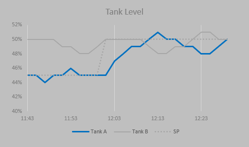
Styling
- Axis to use muted colour
- Monitored value to use pop colour
- Comparison value to use muted colour
- If there’s a comparison to set-point (not value from other vessel), we can use black dotted line
- Horizontal and vertical guideline is not needed most of the time
In most cases, we are not interested in the actual value of the tank, but the relative value. Thus we can ignore the horizontal and vertical line
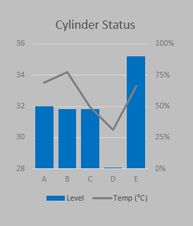
Bar Chart
Bar chart will be mostly used for comparison. Keep using the same “format” throughout the application.
Sample guideline throughout the whole application:
- Chart to the top of horizontal axis to show “produced”
- Chart to the bottom of horizontal axis to show “consumed”
- Chart to the right of vertical axis to show time spent
- If we are comparing consumed vs produced, we can consider using waterfall chart
Pie Chart
Actively avoid pie chart